Responsibilities
I led the end-to-end redesign and rebuild, from discovery and IA to UI design and Framer development. I implemented a CMS-first trip system, collaborated on the filtering component, and owned the booking flow, QA, and launch.
DELIVERABLES
I shipped a full Framer rebuild with a scalable CMS, trip templates, region + trip-type filtering, site search, and supporting pages like Guides and About pages. I also implemented Flybook booking and built a custom handoff component to route users clearly between group and private options.
BUSINESS OBJECTIVES
Skyline needed a website that could scale from a few trips to 60+ without manual page builds and make it easy for customers to find the right trip and book online. The goal was to reduce support emails while presenting a premium, trust-first brand experience.
Impact at a glance
by improving trip discovery and creating a clearer, booking-forward path into Flybook
by building a CMS-first content model and reusable trip templates that scale without manual page builds
by answering the most common pre-booking questions directly on trip pages and clarifying the booking path
by turning trip creation into a structured CMS entry instead of designing and formatting pages manually


Problem
The website didn’t match the product with scattered trip info, no structured discovery, and a manual booking process that created friction and support overhead.
Solution
A premium, booking-forward experience built in Framer with a scalable CMS, region + trip-type filtering, and Flybook booking to reduce confusion and increase conversions.
Problem
There was no structured way to explore trips by filtering. Users had to bounce between pages to find what fit, which slowed down decision-making and booking momentum.

Problem
Trip pages weren’t built for decision-making. Key details like pricing, dates, and how to book (group vs private) were unclear, so users had to reach out before committing.
Solution
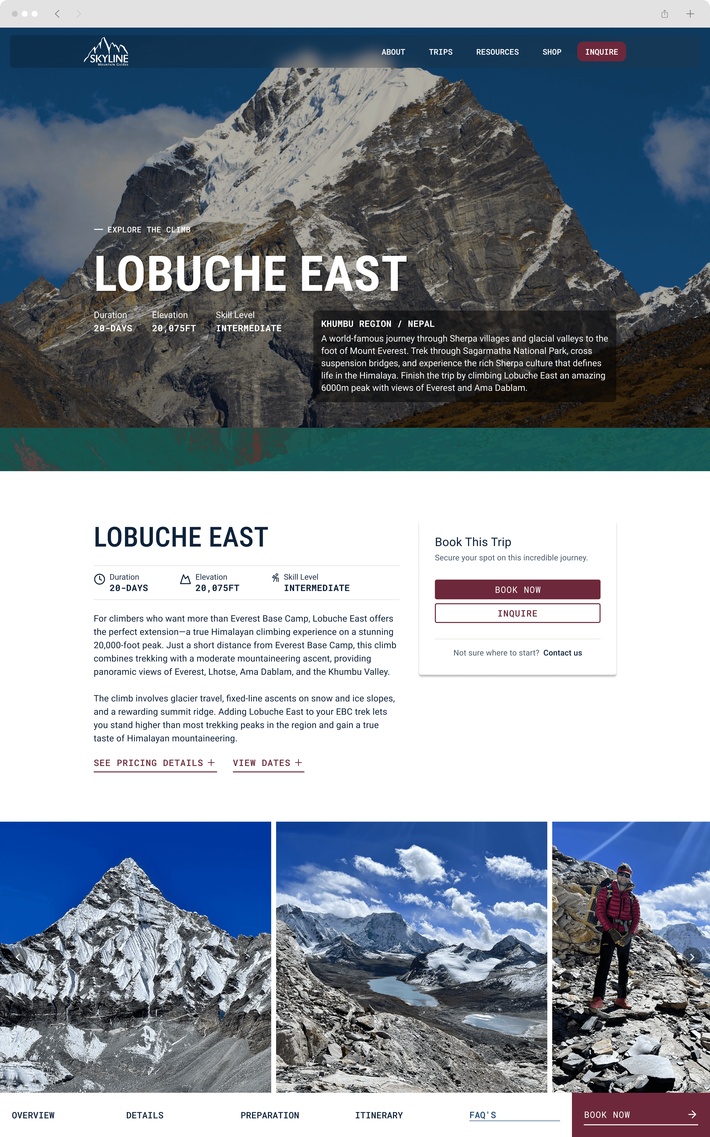
I created a CMS-driven trip template with a booking panel for group/private options, pricing, and dates, plus a sticky sub-nav that organizes the full trip details into clear sections.
The Problem
Land on site
Browse trips
Confirm fit and details
Book online
Needs clear prerequisites and reassurance
Needs fast comparison and quick booking
Needs speed and familiar booking flow
Is this right for my skill
level?
Prereqs + skill level
Duration + difficulty
What’s included + what to expect?
Itinerary + inclusions
Gear + preparation
How do I book and what dates, is it private/group?
Pricing + dates + CTA
Group vs private choice
Help users find the right trip fast (region + trip type)
Make trip details decision-ready (fit, itinerary, gear, pricing, dates)
Enable confident online booking without relying on support emails
My Approach
Fit wasn’t obvious
Prereqs, difficulty, and expectations weren’t consistently surfaced, so users couldn’t self-qualify quickly.
Discovery wasn’t guided
Without region + trip-type structure, users had to hunt and click around to find relevant options.
Booking wasn’t a confident next step
Booking relied on contacting the team, and the path to “Book” wasn’t obvious or consistent across trips.


Rapid Ideation & Userflows
I rapidly ideated on key problem areas using insights gained form high performing usability patterns found in landscape research.

UserFlow
Old browse-to-book flow created drop-off before booking
Original trip booking flow
Land on site
Browse trips
Confirm fit & details
Inquire to book
New flow supports fast discovery and confident booking
New trip booking flow
Land on site
Filter by region/trip type
Open trip page
Review key details
Choose group/private
View pricing + dates
Book via Flybook
Wireframes
I translated the user flow into low-to-medium-fidelity wireframes to lock in the information hierarchy and template structure before moving into visual design. The goal was to make trip pages decision-ready and scalable, so every trip follows the same layout and users can find key details fast.
Module 1
Trip detail page template
Problem: Trip pages had no consistent structure, so users couldn’t reliably find key details and the team couldn’t scale content without rebuilding layouts.
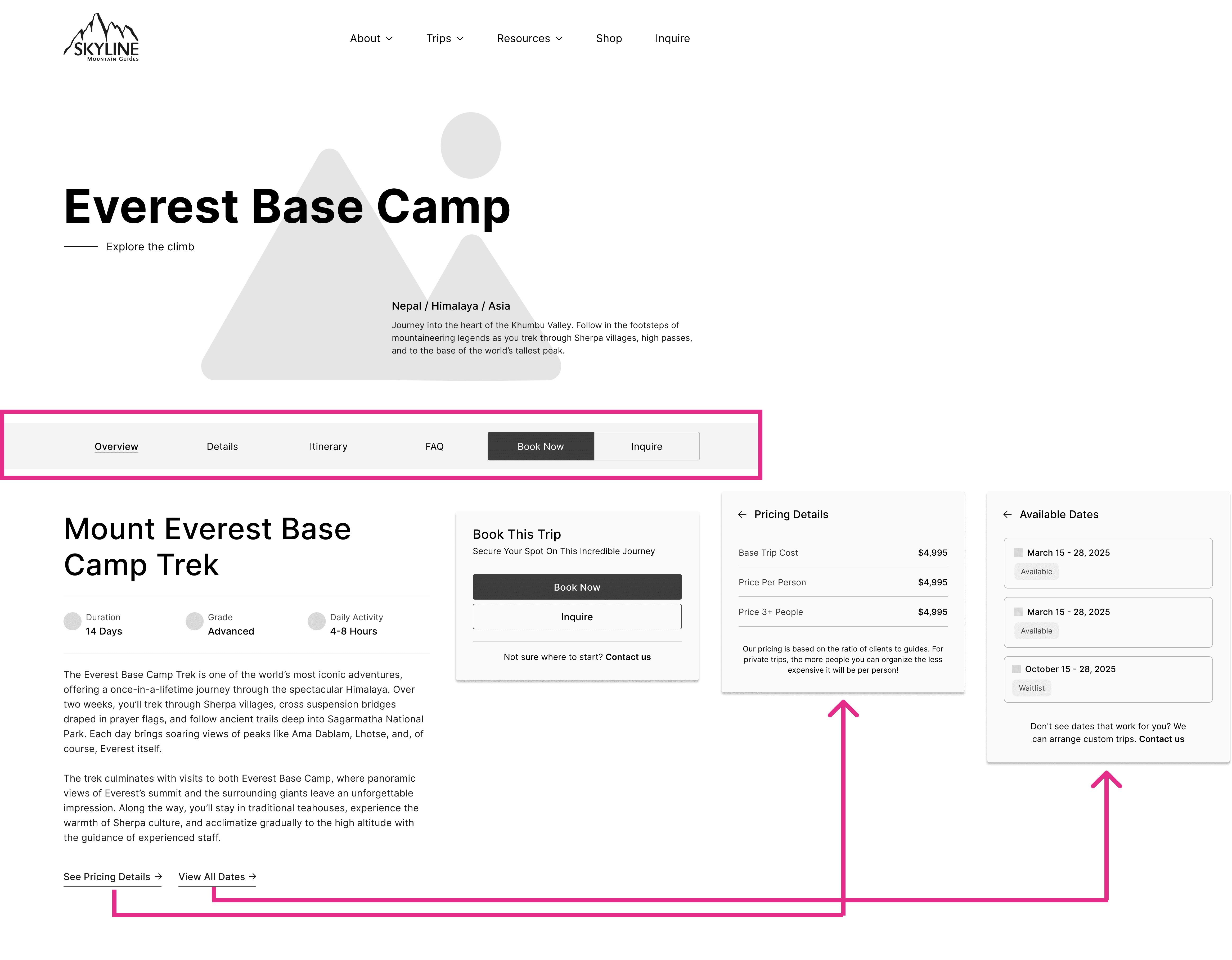
Solution: I wireframed a repeatable trip detail template with a clear hierarchy (fit, details, preparation, itinerary, FAQs, booking) and modular blocks designed to map cleanly to CMS fields.
Module 2
Trip discovery + categorization
Problem: As the catalog grew, trip discovery became overwhelming. Without clear categories and a guided entry point, users couldn’t narrow options fast enough to stay in momentum.

Solution: I wireframed a category-driven discovery experience, including a homepage trip module and region + trip-type organization across the site, so users can explore naturally and find the right trip faster.
Validation & Technical Deep Dive
Wireframes helped me validate the core structure before investing in high-fidelity design and development. I used early walkthroughs to pressure-test the browse-to-book journey and catch constraints while changes were still cheap.
Early Validation Insight: Booking Handoff Constraint
I did validate the wireframes early through structured walkthroughs, both as a team and individually. The goal was to get fresh eyes on the flow, identify confusion points, and surface technical constraints before we committed to the final build.
What the walkthroughs revealed
The trip detail template could display both group and private options (pricing and dates), but it only supported one clear "Book Now" action. That exposed a real constraint: Flybook treats group and private trips as separate entries with separate URLs, so a single button couldn't reliably deep-link users to the correct checkout.
An early proposed workaround was to drop users into Flybook's all-trips list. But that would restart users mid-journey, break context, and introduce a high drop-off risk right at the most important funnel moment.

Problem: Annotated wireframe showing the booking handoff constraint — a single CTA needed to route to two separate Flybook destinations.
I kept one primary CTA to preserve clarity, and introduced choice only when the system required it.
Outcome
Custom React component
Catching this early prevented costly redesign and rework later in the build. The final experience preserves a single, consistent CTA pattern while still routing users to the correct booking destination — reducing confusion and protecting booking momentum during high-intent moments.
I built a custom React component powered by two CMS fields: a group booking URL and a private booking URL. The routing logic works like this:
Both URLs exist → Clicking "Book This Trip" opens a modal where users choose Group or Private, then deep-links to the correct Flybook page.
Only one URL exists → The button deep-links directly — no extra step.
No URL exists → The component shows a fallback message (inquire for availability) rather than a broken or misleading CTA.
Solution: The custom booking handoff component — when both options exist, a modal lets users choose before deep-linking to the correct Flybook page.
I used AI to accelerate initial code scaffolding, but I owned the component logic, edge-case handling, debugging, and testing across real trip configurations in the CMS.
I built a lightweight design system to keep the site consistent across dozens of trip pages and new supporting pages. The system defined typography, spacing, color, and reusable components so the experience stayed premium and scalable as content expanded.
Mood board

Atomic design system


High-Fidelity Designs
After wireframes and early validation, I moved into high-fidelity designs to refine hierarchy, tone, and trust signals. The focus was making trip content scannable, guiding users through long-form details, and keeping the booking action clear at the right decision points.
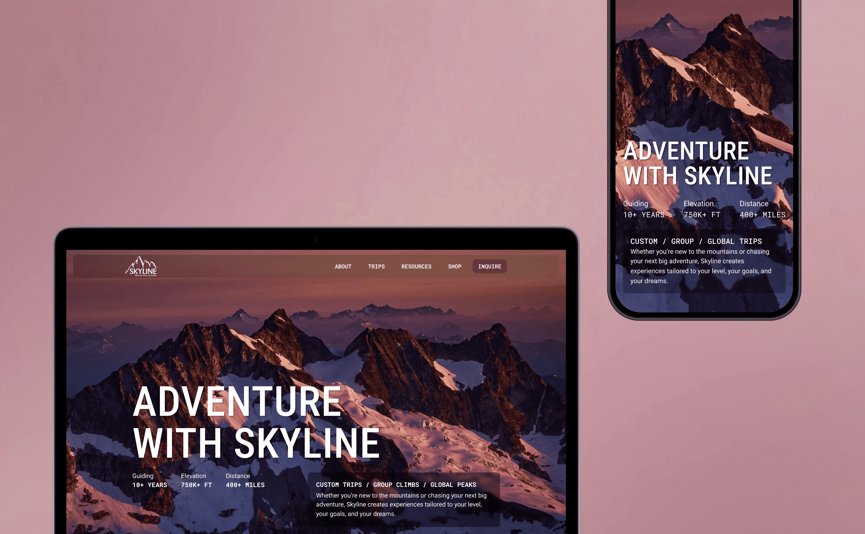
Hero + key stats
Surfacing essential trip info (difficulty, duration, elevation) above the fold so users can self-qualify before scrolling.
Sticky sub-nav
A persistent navigation bar on trip pages that lets users jump between sections without losing context on long-form content.
CTA placement
Booking actions positioned at natural decision points — after key details, after pricing, and persistently accessible via the sub-nav.
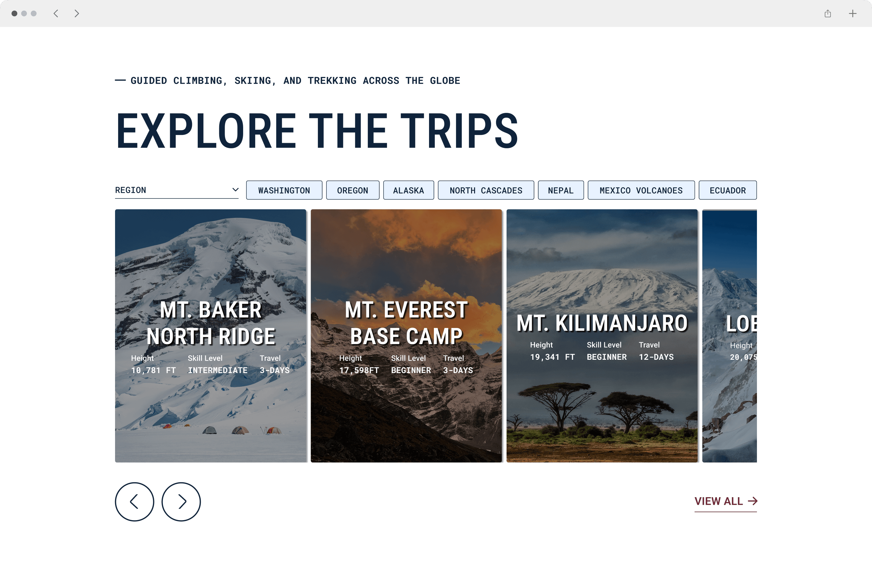
Discovery modules
Homepage carousel and library layouts designed for browsing by region and trip type, optimized for both exploration and intent.


Outcomes
A scalable booking platform.
The rebuild turned Skyline's website into a scalable booking platform. Trips became easier to discover, easier to understand, and easier to book, while the team gained a CMS workflow that supports growth without manual page building.
by improving trip discovery and creating a clearer, booking-forward path into Flybook
by building a CMS-first content model and reusable trip templates that scale without manual page builds
by answering the most common pre-booking questions directly on trip pages and clarifying the booking path
by turning trip creation into a structured CMS entry instead of designing and formatting pages manually
Reflection
This project reinforced how much "premium" is about clarity and consistency, not decoration. I'm proud of what shipped under real constraints, and the biggest improvement I'd make next is stronger instrumentation and structured usability testing now that the product is live.
What I'd improve with more time
Analytics funnel tracking — filter usage, CTA clicks, modal choices, Flybook outbound
Moderated usability testing — discovery, comparison behavior, sub-nav use, booking handoff
Use insights to prioritize Phase 2 content - expansion based on what users actually search for and where they stall